Research
- Crime Categories
- Murder Circumstances
- Charges
- Murder Numbers by SHR
- Definitions of Murder
- Crime Literature
- Other Literature
- Seminars
- Journal Ranking
- Laws
- Changes in Law and Reporting in Michigan
- Citation Guides
- Datasets
Writing
Methods
- BLP
- Econometrics Models
- Econometrics Tests
- Econometrics Resources
- Event Study Plots
- Metrics Literature
- Machine Learning
Python-related
- Python Basic Commands
- Pandas Imports and Exports
- Pandas Basic Commands
- Plotting in Python
- Python web scraping sample page
- Two Sample t Test in Python
- Modeling in Python
R-related
- R Basics
- R Statistics Basics
- RStudio Basics
- R Graphics
- R Programming
- Accessing MySQL Databases from R
Latex-related
Stata-related
SQL
Github
Linux-related
Conda-related
AWS-related
Webscraping
Interview Prep
Other
Plotting in Python
Table of Contents
Matplotlib
Bar charts
Official documentation: here
Example 1:
plt.rcdefaults()
fig, ax = plt.subplots(figsize=(8, 6))
ax.barh(states, amount) # if horizontal bar
ax.invert_yaxis() # labels read top-to-bottom
ax.yaxis.set_ticks(np.arange(min(state), max(state)+1, 1))
plt.ylabel('State')
plt.xlabel('Amount')
plt.show();
Example 2:
df.plot
Seaborn
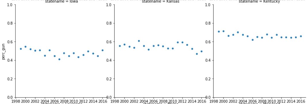
Sometimes we have multiple groups in the data and we would like to generate a plot for each of the groups. First we import the data set:
psg = pd.read_stata('dta_files/perc_suicide_gun.dta')
And then we can plot using the seaborn package
import seaborn as sns
g = sns.FacetGrid(psg, col="statename", hue='law_year', col_wrap=3, height=4)
g = (g.map(plt.scatter, "year", "perc_gun", edgecolor="w").add_legend()) # "year" would be on the x axis and "perc_gun" would be on the y axis
for ax in g.axes.flat:
    ax.set_ylim([0,1])  # set the range for the y axis
    ax.xaxis.set_major_locator(plt.AutoLocator())
    _ = plt.setp(ax.get_xticklabels(), visible=True) # in order to keep track of which group we are referring to
    _ = plt.setp(ax.get_yticklabels(), visible=True)
plt.show() # show the figure inline
g.savefig("perc_suicide_gun.jpg") # save the results as a figure
Part of the results are as below:

Note that the hue=’law_year, ‘ section can introduce a different color for the data points that we would like to highlight - this is not shown above.
Saving figures
To insert the figures into an academic paper, we need them to not have a lot of white space around the figures. For this, bbox_inches='tight' is helpful.
g.savefig("perc_suicide_gun.jpg", bbox_inches='tight') # save the results as a figure