Research
- Crime Categories
- Murder Circumstances
- Charges
- Murder Numbers by SHR
- Definitions of Murder
- Crime Literature
- Other Literature
- Seminars
- Journal Ranking
- Laws
- Changes in Law and Reporting in Michigan
- Citation Guides
- Datasets
Writing
Methods
- BLP
- Econometrics Models
- Econometrics Tests
- Econometrics Resources
- Event Study Plots
- Metrics Literature
- Machine Learning
Python-related
- Python Basic Commands
- Pandas Imports and Exports
- Pandas Basic Commands
- Plotting in Python
- Python web scraping sample page
- Two Sample t Test in Python
- Modeling in Python
R-related
- R Basics
- R Statistics Basics
- RStudio Basics
- R Graphics
- R Programming
- Accessing MySQL Databases from R
Latex-related
Stata-related
SQL
Github
Linux-related
Conda-related
AWS-related
Webscraping
Interview Prep
Other
R Plotting
Disclaimer: a lot of the following was taken from Larry Kaplan’s R tutorial at Boston College.
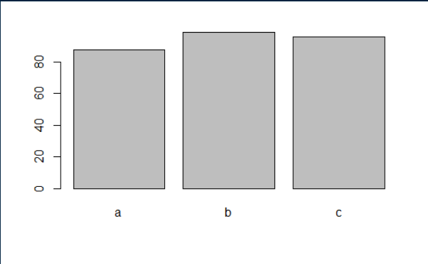
Normal barplot
barplot(table(test2$TestForm))

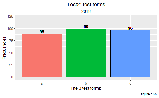
ggplot2 Barplots
ggplot(test2) +
  geom_bar(aes(x = TestForm, fill = TestForm), color = "black") +
  labs(title = "Test2: test forms",
       subtitle = "2018",
       x = "The 3 test forms",
       y = "Frequencies",
       caption = "figure 16b"
       ) +
  theme(plot.title = element_text(hjust = .5),
        plot.subtitle = element_text(hjust = .5),
        legend.position = "none") + # remove the legend
  scale_y_continuous(limits = c(0, 120)) +
  geom_text(label = "88", x = "a", y = 93) + # put the text at ("a", 93)
  geom_text(label = "99", x = "b", y = 104) +
  geom_text(label = "96", x = "c", y = 100)

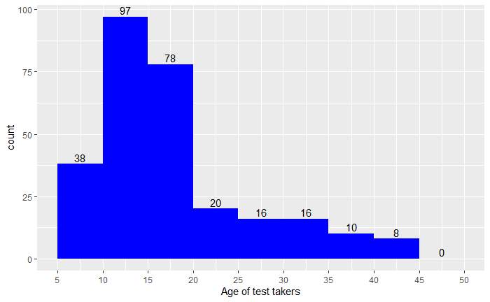
ggplot2 Histograms
ggplot(data = test2) +
  geom_histogram(aes(x = Age),
                     fill = "blue", # fill = ..count..
                     breaks = seq(from = 5, to = 50, by = 5)) +  # x limits
  scale_x_continuous(breaks = seq(from = 5, to = 50, by = 5), # x labels
                     name = "Age of test takers") +
  stat_bin(geom = "text",
           breaks = seq(from = 5, to = 50, by = 5), # labeling each bar
           aes(x = Age, y = ..count.., label = ..count..), vjust = -.3)

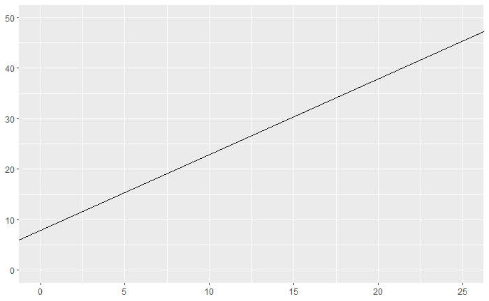
ggplot2 Line
ggplot() +
  scale_x_continuous(limits = c(0,25)) +
  scale_y_continuous(limits = c(0,50)) +
  geom_abline(slope = 1.5, intercept = 8)

ggplot scatter plot
Save the plot
myBarPlot <- ggplot(test2) +
              geom_bar(aes(x = TestForm, fill = TestForm), color = "black") +
              labs(title = "Test2: test forms",
                   subtitle = "2018",
                   x = "The 3 test forms",
                   y = "Frequencies",
                   caption = "figure 16b"
                   ) +
              theme(plot.title = element_text(hjust = .5),
                    plot.subtitle = element_text(hjust = .5),
                    legend.position = "none") +
              scale_y_continuous(limits = c(0, 120)) +
              geom_text(label = "88", x = "a", y = 93) + # put the text at ("a", 93)
              geom_text(label = "99", x = "b", y = 104) +
              geom_text(label = "96", x = "c", y = 101)

setwd("E:/github/blog.lia-yin.com/images")
png("ggplot2.png")
plot(myBarPlot)
dev.off() # close a plotting device
Save graphs as PDF:
ggsave("mp.pdf", gridExtra::marrangeGrob(grobs = pl, nrow=3, ncol=2))